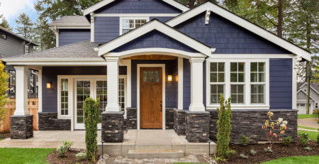

Choosing Interior Paint Colors
If your confidence in choosing colors for your rooms isn’t all that strong, learn more about color placement basics with the rules of thumb below. If you’re sure of your personal style, feel free to break the rules and create new looks that reflect your unique tastes and personality.
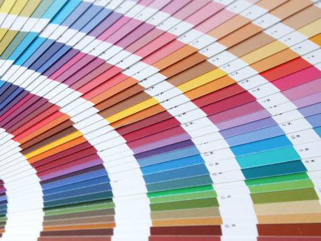
- When creating a color scheme, choose one color as the predominant color and then other colors as accent colors.
- Have a long and narrow room? Consider painting the shorter end walls a darker shade than the long, narrow walls. Darker colors will recede, the light colors will advance – and you’ll create the illusion of width.
- Solids and simple patterns reduce visual weight, while bold patterns add visual weight.
- Bright and intense colors add visual weight, while muted, neutral colors reduce visual weight.
- To make a small room look larger, choose a light-color paint and select furnishings in the same color family. Or, you can paint some of the furniture to match the walls.
- Light affects color dramatically. Fluorescent light tends to be cool lighting and brings out more green or blue in a color. Incandescent light — traditional light bulbs — brings more of the warmth like reds and yellows out in a color. LED “daylight” lights tend to be true “neutral” colors, like sunlight.
- It is important to view colors in day time and night time, because they will appear different, and you want to make sure you like the way the color appears in your room at different times of day.
- The location of color within an interior space can make a great deal of difference in influencing the room’s character. A color placed on a ceiling, wall, or door can elicit many different reactions.
- Perception of temperature may also be altered with color. Most design schemes contain more than one color in a space, so if the design includes a color from each group — warm and cool — coordination of the space is still accomplished.
Red
- Ceilings: Weighty and dramatic
- Walls: Advancing and energetic
- Floors: Confident and grounded
Red is often used as an accent color, but right now it’s a trend using this color on walls. Large amounts of saturated red create a more complex space, while saturated brown-reds can make a room warm and inviting. It’s especially good to use a deep red in places like dining rooms, offices, and dens.
Pink
- Ceilings: Soft hues are delicate and comfortable, and may cast a nice “glow”
- Walls: Can be complementary to skin tones when soft or pale. Pink is dramatic when highly saturated and vivid tones are used. Soft clear shades of pink are often seen as feminine, while bolder, darker shades are becoming more gender-neutral.
- Floors: If you like pink, have at it!
Orange
- Ceilings: Energizing, advancing
- Walls: Soft peachy tones are warm and glowing. Bright tones are energetic, burnt orange shades are rich and warm.
- Floors: Creates movement, excitement, energy
Bright, clear oranges and Mid-Century Modern oranges are absolutely on trend. While orange is reserved typically for accents, pastel oranges are cheerful and lively.
Brown
- Ceiling: Dark hues are heavy but work in high, open ceilings, especially to conceal exposed ductwork.
- Walls: Mid-tone and dark hues can evoke richness, warmth and comfort. Soft hues are natural and create a neutral backdrop for furnishings.
- Floors: Implies durability, stability and reliability.
The light values of brown are good environments for work or for living. The red-browns have a good use in interiors because they bring warmth and comfort.
Yellow
- Ceiling: Light hues are luminous, reflective and glowing. Brights really make a bold statement.
- Walls: Warm if a golden hue, calming if paler and clearer tones. There are so many yellows, it’s recommended to look at your space and see what you like.
- Floors: Bright hues can be distracting and agitating, unless you really like a sunny space.
Clear yellows are happy and energetic. Warmer, more browned yellows are cozy and somber. Yellow is also ideal for safety purposes due to the high visibility qualities, it also appears brighter than white and is useful in poorly illuminated and dim spaces.
Green
- Ceiling: Protective, but reflection on skin tone can be unattractive.
- Walls: Safe, calm, reliable, neutral, yellow-based hues create warmth, blue-based hues tend to be cool.
- Floors: natural up to a certain saturation point (light to dark), soft, relaxing (if closer to blue-green).
Bright, happy mid-tone greens are right on trend. Grass and leaf greens, as well as emerald and jade greens are hot in home fashion. Green is an excellent color for interior environments, especially when involving relaxation, concentration, and meditation. Blends well with most colors if the undertone of cool or warm are matched – or be brave and mix multiple greens in a space for added interest!
Blue
- Ceiling: soft shades are cool and heavenly, dark hues give the illusion of the ceiling advancing.
- Walls: pale to mid-tone shades are soothing, darker hues provide a dramatic backdrop.
- Floors: movement (darker hues) to effortless movement (lighter hues).
Blue can be cold if applied to large areas without texture or additional colors. However, it’s a tried and true favorite here in the South, where blue’s cooling nature can make your rooms seem lighter and cooler. Medium or deep tones are appropriate in areas that you want to feel embracing, cozy, or dramatic. Blue blends well with most other colors, and is a classic favorite.
Gray
- Ceiling: Shaded, creates shadows.
- Walls: Bland to neutral, cool and neutral.
- Floors: Neutral. Blends into a space.
Gray is the color, which inspires creative people to become more creative. Gray is a great classifier. It performs the opposite of orange in that it makes things seem more exclusive. It’s also the “new beige” and is very popular for home enviroments. Gray comes in and out of style, but can be classic depending on how its used with other colors in the room. Dark grey is particularly popular for industrial and modern themes.
White
- Ceiling: Creates lightness and brightness, reflects light and reduces shadows. Classic.
- Walls: Neutral to empty. Clean and bright, makes other room colors “pop” and goes with just about everything.
- Floors: Gorgeous, but can require upkeep.
White indicates clarity, brightness, delicacy, refinement, modern sensibilities, and sophistication. White is considered a classic in the South because it works well standing up to our brighter daylight. All-white work environments encourage great precision. There are many, many shades of white, so be careful of the undertone and feel – yellower whites are more traditional and warm, bluer whites are brighter and more energetic.
Black
- Ceiling: Heavy but works well for an exposed ceiling with open ductwork, or for day sleepers.
- Walls: Drama, drama, drama! Gorgeous in less frequently used rooms like dining areas or as accent walls. Pair with white and you’ll really make a statement.
- Floors: Absorbing, dramatic, and a bit high maintenance – but they do make a statement!
Black is very dependent on where it is used. Black works as an accent color in either residential or business interiors. It is associated with dignity and sophistication.
Whatever colors you choose for your interiors, the Ocean Oaks Painting & Construction team will help you make your vision a reality. Contact us today for a consultation or estimate.